Warm vs Cool Neutrals: How to Pair Them at Home

Warm vs Cool Neutrals: How to Pair Them at Home
Neutrals look straightforward on a paint chart and much trickier on a wall. Two greiges that sit inches apart in the same fan deck can flatten one another once they're up, and the usual culprit is undertone. Get the warm-versus-cool question right and the rest of a scheme tends to fall into line: wood tones agree, textiles settle, and the room feels considered rather than half-finished.
What warm and cool actually mean
Every neutral carries a bias. Warm neutrals lean yellow, red or orange: cream, ivory, oatmeal, sand, biscuit, most beiges, and greys with a brown or pink heart. Cool neutrals lean blue, green or violet: bright white, cool grey, blue-grey, charcoal, and the softer dove greys.
That bias, not lightness, is what makes a neutral warm or cool. A pale cool grey and a deep warm brown are both neutrals, and they sit at opposite ends of the same scale. Depth changes how much of a colour you see; undertone changes what kind of colour it is.
They also behave differently. Warm neutrals feel enveloping and generous, and they glow under lamplight. Cool neutrals feel crisp and calm, and they hold their own in strong daylight. Neither is the default safe choice; they simply do different jobs.
Greige deserves its own warning. Sitting between grey and beige, it can tip either way depending on the light and on whatever sits beside it, which is why two people can paint the same colour and completely disagree about the result. Treat greige as a warm neutral until you have tested it, because most of them lean that way.
Four ways to read a neutral's undertone
Undertones are much easier to see in comparison than in isolation. Try these.
- Put it next to true white. Paint a swatch beside a sheet of bright white paper and view it in daylight. Anything that reads yellow, pink or green is showing you its bias.
- Hold it against the fixed things. Floors, worktops, tiles and brickwork aren't going anywhere, so they make the best test. A grey that looks clean against white paper can turn lilac beside honey-toned oak.
- Look at it after dark. Artificial light exaggerates warmth. A soft cream can go peachy by 9pm, and a cool grey can turn distinctly blue.
- Compare, don't judge alone. Two cool neutrals side by side will reveal which is the cooler of the pair, and that difference is what you notice on a large wall.
- Use a known reference. Keep one warm sample and one cool sample you already trust. Placing a new colour between them shows you instantly which camp it falls into.
How lighting rewrites neutral colours
Light is the second colour in any room, and it changes through the day far more than most of us account for. Rooms get very different light depending on which way they face.
A north-facing room receives cool, blue-tinted light for most of the day. Warm neutrals — oatmeal, sand, soft cream — lift it and stop it reading grey. Cool neutrals in the same room can turn chilly and flat, especially in winter.
A south-facing room gets strong, warm light that pushes cream and beige towards yellow by mid-afternoon. Cool greys and whites temper that heat and keep the space from looking soupy.
East and west rooms shift: eastern light is warm early and cooler later, western light does the reverse. A colour that looks right at 8am can look quite different by 6pm, which is why a sample board beats a snap decision made under shop lighting.
Artificial light matters just as much. Warm-white bulbs at around 2700K flatter cream, beige and greige, adding to their glow; the same bulbs can make a cool grey look dull and slightly green. Cool-white bulbs at 4000K and above do the opposite, sharpening whites and greys while draining the life out of warmer tones. In a room with one overhead fitting and no dimmer, that difference is the whole mood.
Layered lighting complicates the picture further, and usually for the better. If a room has warm table lamps at eye level plus a cooler ceiling wash, both warm and cool neutrals can work — the warm light flatters the beiges, the cooler light keeps the greys from going muddy. Where everything comes from a single source, choose the neutral that suits that source and commit.
Pairing warm and cool in the same room
Most successful neutral schemes are not warm or cool. They are weighted. Pick one temperature to dominate — roughly 70 to 80 per cent — and use the other as a counterpoint in smaller doses.
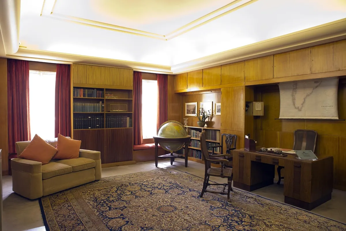
Your fixed elements usually decide the majority vote. If the floor is honey-toned oak and the worktop is travertine, the room is already warm; cool grey walls will fight it unless you deliberately layer in more cool elements to balance. If the floor is pale ash and the tiles are grey, cool neutrals will feel natural and warm creams will look like they arrived by mistake.
An even 50/50 split is the one arrangement to avoid. It reads as indecision rather than contrast, and it is the reason so many rooms with beautiful individual elements never quite come together.
A neutral doesn't have to match the room. It has to agree with the light.
Room-by-room notes
Living rooms
These are usually evening rooms, used under lamplight, so warm neutrals earn their keep: oatmeal, taupe, soft clay, mushroom. A cool grey can work beautifully in a large, bright, south-facing living room, but in a small north-facing one it can feel austere after dark.
Kitchens
Worktops and cabinet fronts are the fixed points here, and they are expensive to change. Test your wall colour against the actual stone or laminate, not a photograph of it. Warm whites with oak, brass and timber shelving feel generous; cool greys with marble, quartz and stainless steel feel precise. Mixing the two works best when the cool element is the hard surface and the warm element is the soft one, or the other way round — just not both at once.
Bedrooms
Warm neutrals tend to win, because bedrooms are low-light rooms and warmth reads as comfort. Oatmeal, ivory and soft sand are forgiving at 6am. Cool neutrals can still work if you add texture — wool, linen, a chunky throw — to soften the edges.
Bathrooms and hallways
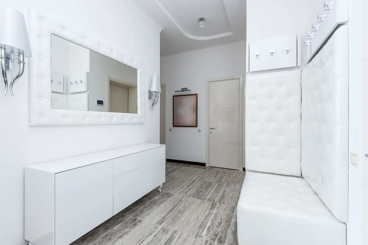
Cool neutrals come into their own. There is usually plenty of tile, glass, chrome and pale grout, all of which are already cool, and cool walls sit quietly alongside them. Warm neutrals here risk looking yellowed against white sanitaryware.
Wood, metal and stone
These are the elements that decide which way a neutral will lean, so read them before you buy paint.
- Warm woods: oak, walnut, teak, cherry and anything with a honey or red cast.
- Cool woods: pale ash, birch, grey-washed oak, limed timber and weathered finishes.
- Warm metals: brass, gold, copper, aged bronze.
- Cool metals: chrome, nickel, pewter, brushed steel. Black sits comfortably with either.
- Stone: travertine, limestone and warm marble lean warm; Carrara-style marble, slate and concrete lean cool.
The practical rule is simple: match the neutral to the largest fixed surface, then use the other temperature as an accent in lighting, textiles or artwork where it is cheap to change.
Common mistakes to avoid
- Judging a colour on a tiny chip. A 10cm square hides undertone. Paint an A3 board instead, two coats, and move it around the room.
- Matching everything too closely. Five neutrals in the same temperature and depth go flat. Vary the depth by a step or two.
- Ignoring the floor. It is the biggest surface in the room and it always votes.
- Assuming greige is neutral ground. It is not; it is a warm or cool colour with a vague name.
- Using stark bright white trim against warm walls. The contrast turns the walls yellow. Choose a trim white in the same family.
A simple testing routine
- Narrow the field to three colours: one warm, one cool, one in between.
- Paint each onto a large board and let it dry fully — colours shift as they cure.
- Fix the boards to the wall and live with them for three days, checking morning, afternoon and evening.
- Look at them next to the floor, the worktop and any tile that will stay.
- Choose, then commit fully rather than hedging with a compromise shade.
Get the temperature right and neutrals stop being a risk. They become the quiet structure that lets everything else in the room make sense.
Photo: Markus Spiske / Pexels